| Top |  |
 |
 |
 |
Functions
| GtkWidget * | gtk_check_button_new () |
| GtkWidget * | gtk_check_button_new_with_label () |
| GtkWidget * | gtk_check_button_new_with_mnemonic () |
| const char * | gtk_check_button_get_label () |
| void | gtk_check_button_set_label () |
| gboolean | gtk_check_button_get_use_underline () |
| void | gtk_check_button_set_use_underline () |
| void | gtk_check_button_set_group () |
| gboolean | gtk_check_button_get_active () |
| void | gtk_check_button_set_active () |
| gboolean | gtk_check_button_get_inconsistent () |
| void | gtk_check_button_set_inconsistent () |
Properties
| gboolean | active | Read / Write |
| GtkCheckButton * | group | Write |
| gboolean | inconsistent | Read / Write |
| char * | label | Read / Write |
| gboolean | use-underline | Read / Write |
Implemented Interfaces
GtkCheckButton implements GtkAccessible, GtkBuildable, GtkConstraintTarget and GtkActionable.
Description
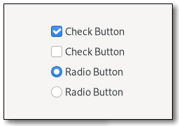
A GtkCheckButton places a label next to an indicator.
CSS nodes
1 2 3 |
checkbutton[.text-button] ├── check ╰── [label] |
A GtkCheckButton has a main node with name checkbutton. If the “label” property is set, it contains a label child. The indicator node is named check when no group is set, and radio if the checkbutton is grouped together with other checkbuttons.
Functions
gtk_check_button_new_with_label ()
GtkWidget *
gtk_check_button_new_with_label (const char *label);
Creates a new GtkCheckButton with a GtkLabel next to it, if
label
is non-NULL.
gtk_check_button_new_with_mnemonic ()
GtkWidget *
gtk_check_button_new_with_mnemonic (const char *label);
Creates a new GtkCheckButton containing a label. Underscores
in label
indicate the mnemonic for the check button.
gtk_check_button_get_label ()
const char *
gtk_check_button_get_label (GtkCheckButton *self);
Returns the label of the checkbutton.
gtk_check_button_set_label ()
void gtk_check_button_set_label (GtkCheckButton *self,const char *label);
Sets the text of self
. If “use-underline” is TRUE,
the underscore in label
is interpreted as mnemonic indicator,
see gtk_check_button_set_use_underline() for details on this behavior.
gtk_check_button_get_use_underline ()
gboolean
gtk_check_button_get_use_underline (GtkCheckButton *self);
Returns the current value of the “use-underline” property.
Returns
The value of the “use-underline” property.
See gtk_check_button_set_use_underline() for details on how to set a new value.
gtk_check_button_set_use_underline ()
void gtk_check_button_set_use_underline (GtkCheckButton *self,gboolean setting);
Sets the new value of the “use-underline” property.
See also gtk_check_button_get_use_underline().
If setting
is TRUE, an underscore character in self
's label indicates
a mnemonic accelerator key. This behavior is similar to “use-underline”.
gtk_check_button_set_group ()
void gtk_check_button_set_group (GtkCheckButton *self,GtkCheckButton *group);
Adds self
to the group of group
. In a group of multiple check buttons,
only one button can be active at a time.
Setting the group of a check button also changes the css name of the indicator widget's CSS node to 'radio'.
The behavior of a checkbutton in a group is also commonly known as a 'radio button'.
Note that the same effect can be achieved via the GtkActionable api, by using the same action with parameter type and state type 's' for all buttons in the group, and giving each button its own target value.
gtk_check_button_get_active ()
gboolean
gtk_check_button_get_active (GtkCheckButton *self);
Returns the current value of the “active” property.
Returns
The value of the “active” property.
See gtk_check_button_set_active() for details on how to set a new value.
gtk_check_button_set_active ()
void gtk_check_button_set_active (GtkCheckButton *self,gboolean setting);
Sets the new value of the “active” property.
See also gtk_check_button_get_active().
Setting “active” to TRUE will add the :checked: state to
both the checkbutton and the indicator CSS node.
gtk_check_button_get_inconsistent ()
gboolean
gtk_check_button_get_inconsistent (GtkCheckButton *check_button);
Returns whether the check button is in an inconsistent state.
gtk_check_button_set_inconsistent ()
void gtk_check_button_set_inconsistent (GtkCheckButton *check_button,gboolean inconsistent);
If the user has selected a range of elements (such as some text or spreadsheet cells) that are affected by a check button, and the current values in that range are inconsistent, you may want to display the toggle in an "in between" state. Normally you would turn off the inconsistent state again if the user checks the check button. This has to be done manually, gtk_check_button_set_inconsistent only affects visual appearance, not the semantics of the button.
Property Details
The “active” property
“active” gboolean
If the toggle button should be pressed in.
Owner: GtkCheckButton
Flags: Read / Write
Default value: FALSE
The “group” property
“group” GtkCheckButton *
The check button whose group this widget belongs to.
Owner: GtkCheckButton
Flags: Write
The “inconsistent” property
“inconsistent” gboolean
If the check button is in an “in between” state.
Owner: GtkCheckButton
Flags: Read / Write
Default value: FALSE
The “label” property
“label” char *
Text of the label widget inside the button, if the button contains a label widget.
Owner: GtkCheckButton
Flags: Read / Write
Default value: NULL
Signal Details
The “toggled” signal
void
user_function (GtkCheckButton *checkbutton,
               gpointer        user_data)
Emitted when the buttons's “active” flag changes.
Flags: Run First