| Top |  |
 |
 |
 |
Functions
| GtkWidget * | gtk_header_bar_new () |
| void | gtk_header_bar_set_title_widget () |
| GtkWidget * | gtk_header_bar_get_title_widget () |
| void | gtk_header_bar_pack_start () |
| void | gtk_header_bar_pack_end () |
| void | gtk_header_bar_remove () |
| void | gtk_header_bar_set_show_title_buttons () |
| gboolean | gtk_header_bar_get_show_title_buttons () |
| void | gtk_header_bar_set_decoration_layout () |
| const char * | gtk_header_bar_get_decoration_layout () |
Properties
| char * | decoration-layout | Read / Write |
| gboolean | show-title-buttons | Read / Write |
| GtkWidget * | title-widget | Read / Write |
Description
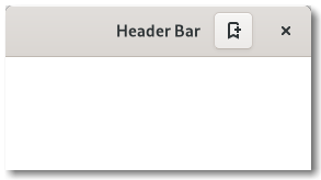
GtkHeaderBar is similar to a horizontal GtkBox. It allows children to be placed at the start or the end. In addition, it allows the window title to be displayed. The title will be centered with respect to the width of the box, even if the children at either side take up different amounts of space.
GtkHeaderBar can add typical window frame controls, such as minimize, maximize and close buttons, or the window icon.
For these reasons, GtkHeaderBar is the natural choice for use as the custom
titlebar widget of a GtkWindow (see gtk_window_set_titlebar()), as it gives
features typical of titlebars while allowing the addition of child widgets.
The GtkHeaderBar implementation of the GtkBuildable interface supports adding children at the start or end sides by specifying “start” or “end” as the “type” attribute of a <child> element, or setting the title widget by specifying “title” value.
By default the GtkHeaderBar uses a GtkLabel displaying the title of the window it is contained in as the title widget, equivalent to the following UI definition:
1 2 3 4 5 6 7 8 9 10 11 12 13 |
<object class="GtkHeaderBar"> <property name="title-widget"> <object class="GtkLabel"> <property name="label" translatable="yes">Label</property> <property name="single-line-mode">True</property> <property name="ellipsize">end</property> <property name="width-chars">5</property> <style> <class name="title"/> </style> </object> </property> </object> |
CSS nodes
1 2 3 4 5 6 7 8 9 10 |
headerbar ╰── windowhandle ╰── box ├── box.start │ ├── windowcontrols.start │ ╰── [other children] ├── [Title Widget] ╰── box.end ├── [other children] ╰── windowcontrols.end |
A GtkHeaderBar's CSS node is called headerbar. It contains a windowhandle
subnode, which contains a box subnode, which contains two box subnodes at
the start and end of the header bar, as well as a center node that represents
the title.
Each of the boxes contains a windowcontrols subnode, see GtkWindowControls
for details, as well as other children.
Functions
gtk_header_bar_set_title_widget ()
void gtk_header_bar_set_title_widget (GtkHeaderBar *bar,GtkWidget *title_widget);
Sets the title for the GtkHeaderBar.
When set to NULL, the headerbar will display the title of the window it is
contained in.
The title should help a user identify the current view. To achieve the same style as the builtin title, use the “title” style class.
You should set the title widget to NULL, for the window title label to be
visible again.
gtk_header_bar_get_title_widget ()
GtkWidget *
gtk_header_bar_get_title_widget (GtkHeaderBar *bar);
Retrieves the title widget of the header. See
gtk_header_bar_set_title_widget().
gtk_header_bar_pack_start ()
void gtk_header_bar_pack_start (GtkHeaderBar *bar,GtkWidget *child);
Adds child
to bar
, packed with reference to the
start of the bar
.
gtk_header_bar_pack_end ()
void gtk_header_bar_pack_end (GtkHeaderBar *bar,GtkWidget *child);
Adds child
to bar
, packed with reference to the
end of the bar
.
gtk_header_bar_remove ()
void gtk_header_bar_remove (GtkHeaderBar *bar,GtkWidget *child);
Removes a child from bar
, after it has been added
with gtk_header_bar_pack_start(), gtk_header_bar_pack_end()
or gtk_header_bar_set_title_widget().
gtk_header_bar_set_show_title_buttons ()
void gtk_header_bar_set_show_title_buttons (GtkHeaderBar *bar,gboolean setting);
Sets whether this header bar shows the standard window title buttons including close, maximize, and minimize.
gtk_header_bar_get_show_title_buttons ()
gboolean
gtk_header_bar_get_show_title_buttons (GtkHeaderBar *bar);
Returns whether this header bar shows the standard window title buttons.
gtk_header_bar_set_decoration_layout ()
void gtk_header_bar_set_decoration_layout (GtkHeaderBar *bar,const char *layout);
Sets the decoration layout for this header bar, overriding the “gtk-decoration-layout” setting.
There can be valid reasons for overriding the setting, such as a header bar design that does not allow for buttons to take room on the right, or only offers room for a single close button. Split header bars are another example for overriding the setting.
The format of the string is button names, separated by commas. A colon separates the buttons that should appear on the left from those on the right. Recognized button names are minimize, maximize, close and icon (the window icon).
For example, “icon:minimize,maximize,close” specifies a icon on the left, and minimize, maximize and close buttons on the right.
gtk_header_bar_get_decoration_layout ()
const char *
gtk_header_bar_get_decoration_layout (GtkHeaderBar *bar);
Gets the decoration layout set with
gtk_header_bar_set_decoration_layout().
Property Details
The “decoration-layout” property
“decoration-layout” char *
The decoration layout for buttons. If this property is not set, the “gtk-decoration-layout” setting is used.
See gtk_header_bar_set_decoration_layout() for information
about the format of this string.
Owner: GtkHeaderBar
Flags: Read / Write
Default value: NULL
The “show-title-buttons” property
“show-title-buttons” gboolean
Whether to show title buttons like close, minimize, maximize.
Which buttons are actually shown and where is determined by the “decoration-layout” property, and by the state of the window (e.g. a close button will not be shown if the window can't be closed).
Owner: GtkHeaderBar
Flags: Read / Write
Default value: TRUE
The “title-widget” property
“title-widget” GtkWidget *
Title widget to display.
Owner: GtkHeaderBar
Flags: Read / Write